One of the common questions we get is how to best utilize NDVI imagery for optimizing management practices. GreenSight has spent quite a lot of time maximizing the quality and usability of our NDVI, one reason we often refer to it as “GSNDVI” because they are not all created equally! Under the covers we use machine learning and artificial intelligence to filter and distill the data down into just what you are interested in! One of the features we offer in our portal is the ability to dynamically change the colorization of the NDVI, which is a powerful tool to drill down even further and bring out the detail you are looking for. In this article we’ll take a deeper dive into GreenSight’s dynamic map colorization feature. Before we jump in, to better understand why you may want to tweak the default colorization of your NDVI and Thermal maps it is helpful to understand how we generate these maps in the first place!
In a previous article “Getting to Know Your Thermal Imagery” we explained in detail how Thermal maps are generated and how to interpret them. In this article we’ll go through a similar exercise with NDVI maps. We’ll explain how your fully colorized NDVI maps are generated and how the new dynamic colorization feature can help dial them in further.
As a quick refresher, the basic concept behind NDVI (Normalized Difference Vegetative Index) is that healthy green vegetation strongly reflects near-infrared light, which is invisible to the naked eye, while absorbing visible red light. NDVI provides us with a useful estimation of plant health by quantifying the amount of NIR reflected by a plant in relation to the amount of red light it absorbs. NDVI values range between -1 and 1 with higher NDVI values generally being indicative of relatively greener, healthier vegetation. NDVI is calculated using the simple mathematical formula below:
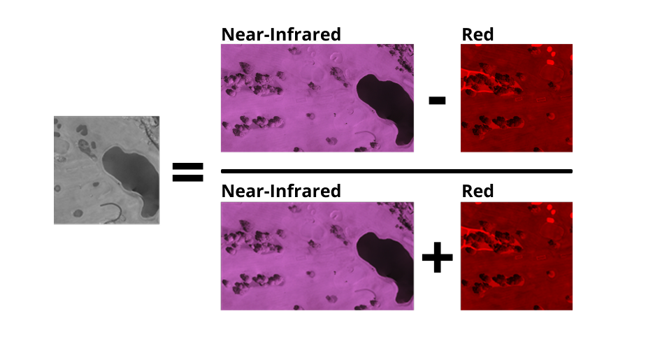
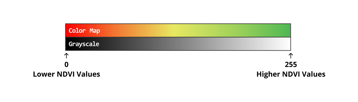
Did you know our raw processed NDVI maps are actually Grayscale? Your GreenSight Dreamer drone is equipped with 2 different cameras and a patented GreenSight thermal sensor. Each time you fly we simultaneously capture RBG Visible, Near-Infrared, and Thermal Imagery. We then utilize the RBG Visible imagery and the Near-Infrared imagery to generate a raw grayscale NDVI map.
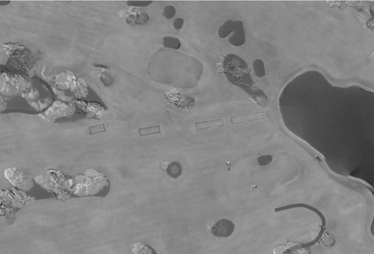
Grayscale NDVI Image
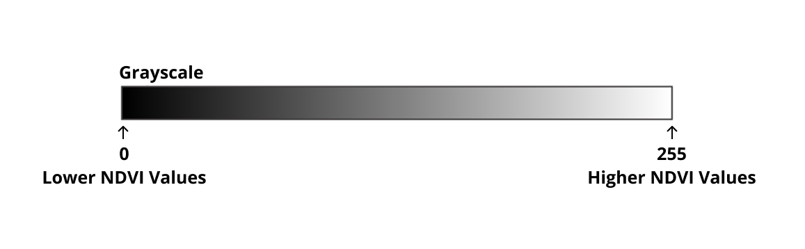
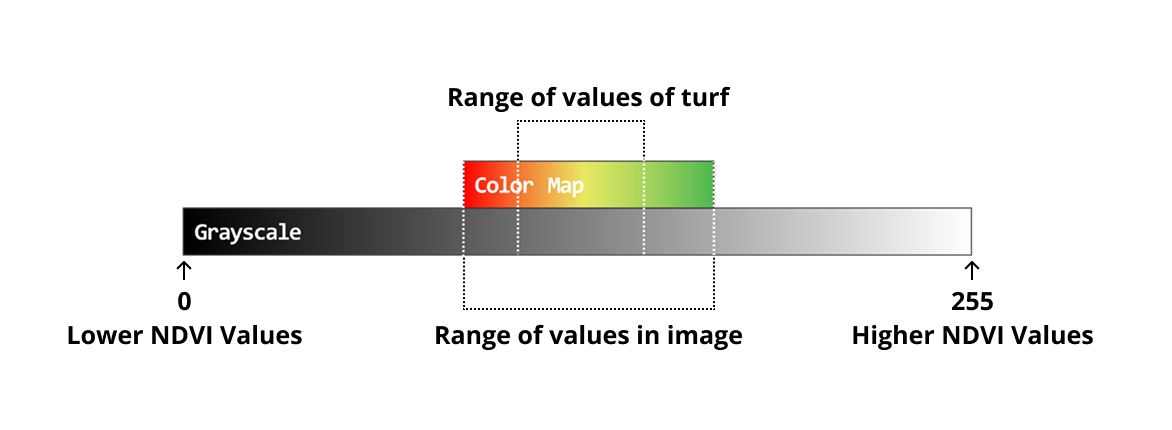
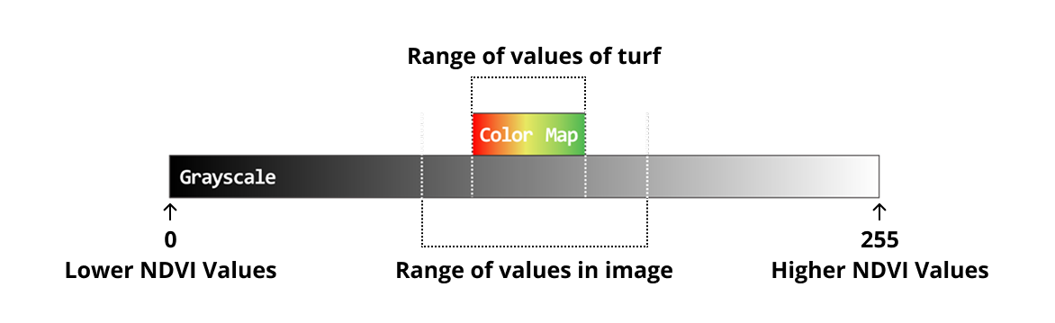
Each pixel in the grayscale map holds a value between 0 and 255. The closer to 0 the lower the NDVI value and vice versa
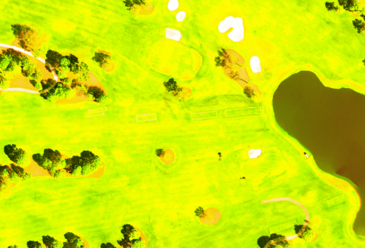
Grayscale maps are interesting to look at but practically useless when trying to visually identify small or even moderate variations in NDVI values across the entire map. In the grayscale NDVI image above we can see clearly that the sand traps, cart paths, and bodies of water appear almost black signifying very low NDVI values. The tops of the trees appear nearly white signifying much higher NDVI values. These features appear at drastically opposite ends of the spectrum so it is easy to identify them. However the areas of turf, which are our primary concern in this image, all hold pixel values within a tighter range of the grayscale making it difficult to visually identify differences in NDVI values that we may be concerned about.
To make these grayscale NDVI maps more useful we apply what is called a “color-map” to the grayscale values. Essentially, we are “mapping” a certain RGB color to a grayscale pixel value. In the color-map displayed below we have mapped dark red to a grayscale pixel value of 0 and dark green to a grayscale pixel value of 255. Each grayscale pixel value between 0 and 255 is assigned a different RGB color ranging from red to green.
When we apply this color-map to the grayscale image above the results are better but still less than ideal. You will notice in the image below that applying this color-map certainly helps us to begin to identify more subtle variations throughout the map but overall it still lacks quite a bit of contrast.
The reason the now colorized image still lacks a bit of contrast is because we have stretched the upper and lower bounds of our color-map across the entire range of grayscale values from 0 to 255. The reality is that the grayscale image above does not contain any pixels that have values in the upper or lower ranges of the grayscale. In the grayscale image above all pixel values fall within a range of 70 to 130. By stretching our color-map too wide we have effectively limited the contrast and range of colors in our colorized image. We have now mapped a wide range of red and green colors to grayscale pixel values that don’t even exist in the image. This causes the image to appear mostly yellow and lacking definition.
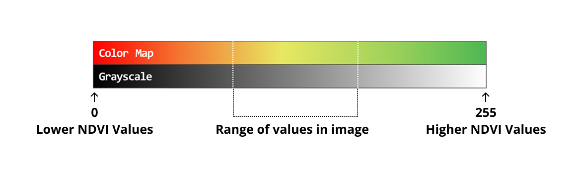
One solution to providing higher contrast colorized images is to shrink the upper and lower bounds of the color-map so that the color-map only stretches across the range of grayscale values that are present in the grayscale NDVI image.
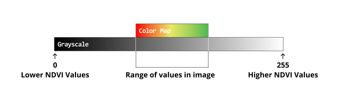
When we apply this new color-map with tighter upper and lower bounds to the grayscale image above the results begin to look a lot better. You will notice in the colorized image below areas of higher and lower NDVI values are now easier to discern and the overall contrast is improved.
To improve the presentation of your colorized NDVI maps even greater, GreenSight uses artificial intelligence and machine learning to more precisely determine where to set the upper and lower bounds of the color-map and where to center the color-map for each of your missions. This is a critical step in presenting you with actionable and meaningful data.
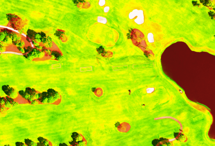
As we learned above, more useful colorized NDVI maps are typically achieved by limiting the upper and lower bounds of your color-map to only the range of grayscale pixel values present in a grayscale NDVI map. This method typically works well for golf courses where areas of turf comprise the majority of the imagery. But what happens when we use this same method on a golf course that is located in the desert or a heavily forested area?
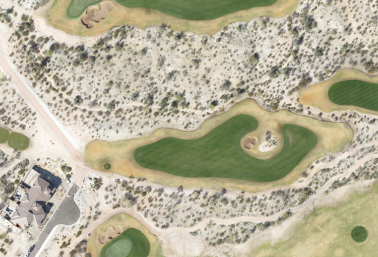
Take for example the image below. The areas of turf in the image are far outnumbered by areas of desert.
In this case, if we were to stretch our color-map across the entire range of values present in the image, we would be applying a wide range of colors to areas that we don’t really care about.
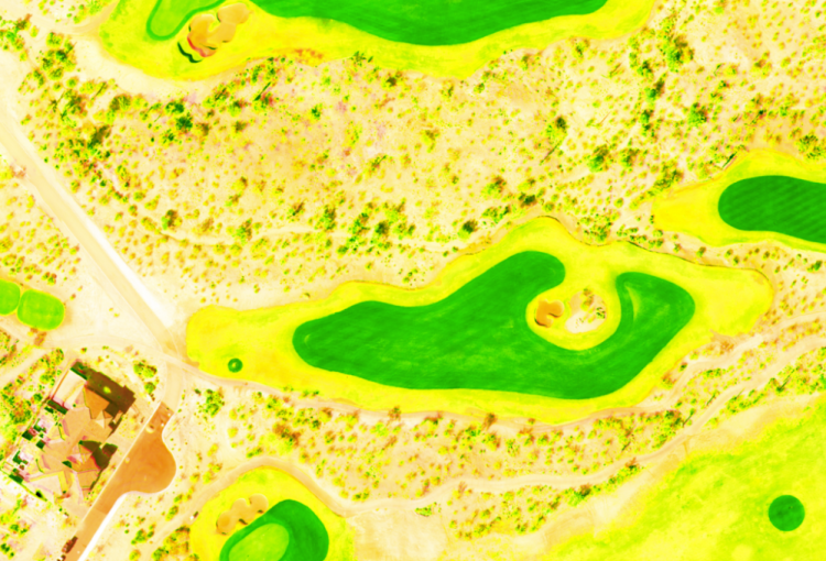
In the image below you will notice that stretching the color-map across the entire range of grayscale values present in the image produces a colorized NDVI map that shows a lot of contrast in the desert areas but hardly any in the areas of turf we care about. That is unless NDVI values of sand are interesting to you. The only reasonable determination that can be made from the image below is that areas of turf have a much higher NDVI value than areas of sand, which isn’t exactly a profound determination.
To solve this issue, GreenSight has trained an artificial intelligence to recognize and classify the various regions of your golf course such as greens, tees, fairways, sand traps, water, roads, etc. Each time your drone performs a mission our A.I. uses a multi-class segmentation algorithm to generate a new map of classified regions of your property.
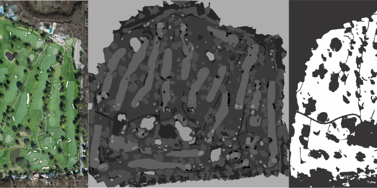
We then segment all of the areas of turf from non-turf and generate a turf vs non-turf mask. With our areas of turf segmented from areas of non-turf we are able to apply this mask to the grayscale NDVI map and separate the areas of the map we care about in terms of NDVI analysis from areas we do not. We are then able to apply our color-map to the range of grayscale pixel values that represent only areas of turf in the image.
The results are typically exceptional. In the colorized image below we can now see areas of lower NDVI values on the greens, tees, and fairways highlighted and more visually pronounced than before.

How do I manually tweak my color-map?
GreenSight processes all of your NDVI and thermal mission maps in the manner described above by default. You can view these maps in your GreenSight portal with the default color-map parameters applied or if you choose you can manually tweak these color-map parameters and save them to a mission individually. If you wish you can also save the offsets you create to be applied to all future missions that we process for you.
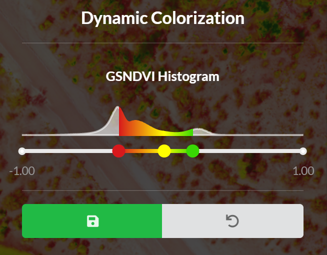
To tweak your color-map for any given mission you can click the “Adjust Colormap” button in the top right corner of your GreenSight portal.
A panel will appear on the left hand side of the screen containing the controls to tweak your color-map and save your edits.

You will notice a histogram with three sliders to tweak your color-map. The histogram displays the disbursement of grayscale pixel values in a range of 0 to 255 across the entire mission map. The two outer sliders control the upper and lower bounds of your color-map. If you want to stretch or limit your color-map across a certain range of values you can adjust these sliders. The middle slider control represents the center of your color-map. Sliding the middle slider more to the left adds a wider range of greens and yellows to the color-map. Sliding the middle slider more to the right adds a wider range of reds and oranges to the color-map.